With recruiting becoming near impossible, a renewed emphasis on people as the most important asset has come to rise. Enter the Meet the Team page.
In this post, we’ve highlighted some of our favorite Meet the Team pages, and some that just barely missed the mark. We’ll also help you understand more about these useful pages, and how you can scale virtual headshots for your team, no matter what direction you choose for your page.
What is a “Meet the Team” Page and Why Do You Need One?
Simply put, the Meet the Team page highlights your most important asset: People.
In a digital-first economy where people can work from anywhere, recruiting is no longer a local game, but a global one. The companies who prioritize their people (or at least appear to) will win.
Execute the Meet the Team page well, and position your company as people-first. Do it poorly and get passed up by the best recruits (and potential customers and investors).
Five Meet the Team Pages We Love
1. Digital Marmalade

Each employee at this London-based marketing agency has a trading card-style profile image. When you click on the image, stats appear detailing actual marketing accomplishments and personal facts, as well as fictional superhero abilities. It’s a quirky twist that gives visitors a more engaging snapshot of the agency’s team. This highlights both their impressive experience and their friendly culture.
The overall effect works so well because Digital Marmalade balances its show of technical proficiency and creative individualism. Visually, the headshots are all similar in composition and background, creating balance and cohesion for the team. You can see that the employees opted for (or were instructed to wear) collared dress shirts.
2. Cloud Horizon
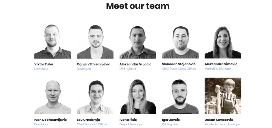
Cloud Horizon is a mobile product development company. Their Meet the Team page highlights their drive and dedication to bringing business ideas to life through impactful storytelling. While the “About” page starts very text-heavy, you can scroll down to see the team.
Once your get to the “Meet our team” portion of the page, you’re met with very professional-looking headshots. When you hover over a photo, it flips to reveal the employee’s childhood photo. Instead of their job title, you’re shown a description of what the employee wanted to be when they were younger.
This design works because it maintains professionalism and clear visual branding, while also humanizing each employee.
3. FCINQ
If you’re looking for a great example of a cohesive, fun staff page, check out French company FCINQ’s. Just scroll down their home page until you come across a sea of colorful pink, blue, and purple bubbles.
Their team member page is clean and colorful, and could easily have been created remotely. You can see information about the teams’ awards and the projects that they have completed, as well as headshots of each employee. Clicking on a photo slightly enlarges and colorizes it, and brings forth their name and LinkedIn and Twitter links.
The splashy setup is a stylish alternative to the expected rows of team photos and names.
It works so well because FCINQ’s team section is a nice departure from the standard grid layout while staying intuitive and informative.
4. Stink Studios

Each image is distinguished by a vibrant background color. Only six or seven employees are shown at a time, allowing you to focus on the individual. The page refreshes quickly, showing you a new set of employees.
The light and airy interface conveys a friendly, confident team. Each employee smiles broadly and looks at ease, though the photos are neatly edited and polished.
5. Quarles & Brady LLP
You may have noticed that a lot of the teams pages we love have a flair for the creative. But some industries require a bit more gravitas, as their photos aim for trustworthiness and propriety. That’s why we are including a law firm, Quarles & Brady, as one of the pages we love.
To get to their page, you go through a brief “search” to select a focus area and location. Then you’re “matched” with attorneys in that field of expertise. Since they employ a staff of hundreds of attorneys, this sorting step is necessary.
The landing page after a search includes a small, professional headshot. All of the photos feature a similar, staid gray background, and attorneys wearing suits. Next to each photo is the attorney’s name, their contact information, and an option to click “more” to take you to their profile page. Once on each individual page, there is a larger headshot and more complete bio.
For industries like finance or legal services, this is exactly the type of teams page and photo you’d expect. If your firm has a specific brand color, you can play this up in the background or in your employees’ wardrobe choices.
Three Meet the Team Pages That Just Miss the Mark
Meet the Team pages are a great way to personalize your company’s brand and messaging. But if you don’t give it the proper attention, these pages can miss the mark. Here are a few examples of pages that could be great with just a bit of tweaking.
1. Chromatic
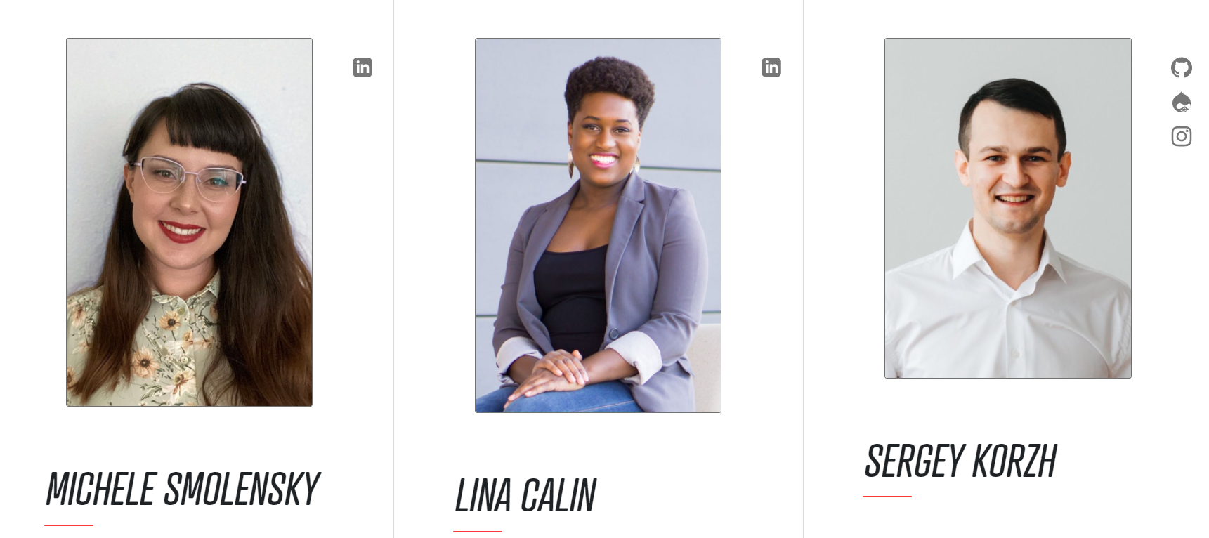
Their individual photos under the “Our Team” section features employees in business casual outfits against mostly uniform, clean backgrounds. However, we say “mostly” because two staffers have different backgrounds. This is a typical hiccup that can occur when new hires or remote hires join a team.
We do love that each employee has an icon linking to their various social media platforms (including GitHub and Drupal), as well as an option to “learn more” and navigate to a full bio with a list of skills.
2. Station Four

The employees are wearing a wide range of styles, from a formal suit and tie to a casual cardigan and top. But the biggest offense is that the photos are low-resolution and poorly edited. With just a bit more focus on quality photos, this would be a truly standout teams page!
3. Atlantic BT

Once again, it looks like this company has fallen victim to the dreaded “new hire” issue. Many of these headshots are lit differently than the others, lack polish and editing, or are sized much larger or smaller than the rest. One image is even black and white, while all the rest are color.
These inconsistencies make individual employees stand out – and not in a good way. To ensure team cohesion and aesthetics, it’s vital to pay attention to such details.
How to Get Headshots for Your Teams Page
One of the constant struggles of a Meet the Team page is keeping it up to date. Schedule a photo day on-site, and it’s typical that someone misses the memo or is absent. And when you have an employee depart or a new hire joins the team, the page quickly becomes outdated. Worse yet, new hires often end up with photos that disrupt the team’s consistency and stick out like a sore thumb. As you can see from our examples of pages that just nearly missed the mark, this is a wide-ranging issue.
In-person or remote?
Traditional photoshoots with a professional photographer can be time-consuming, expensive, and difficult to replicate when you have a new hire. Additionally, with more teams working remotely and from across the country, an in-person shoot can be unrealistic.
Headshots.com offers a simple way to get virtual headshots, whether your team is together in person or working remotely. With a bit of direction for your employees and a custom background, your website team pictures will be cohesive and polished. Headshots.com coordinates your team and handles all the details. Meanwhile, team leaders can track progress and download headshots directly from the dashboard.
